The team's demo stand at IHM 2024
This document summarizes a subset of the team’s recent and ongoing work team that we will be presenting at the IHM of IHM 2024 in Paris.
Theme: Communication around Environmental Issues
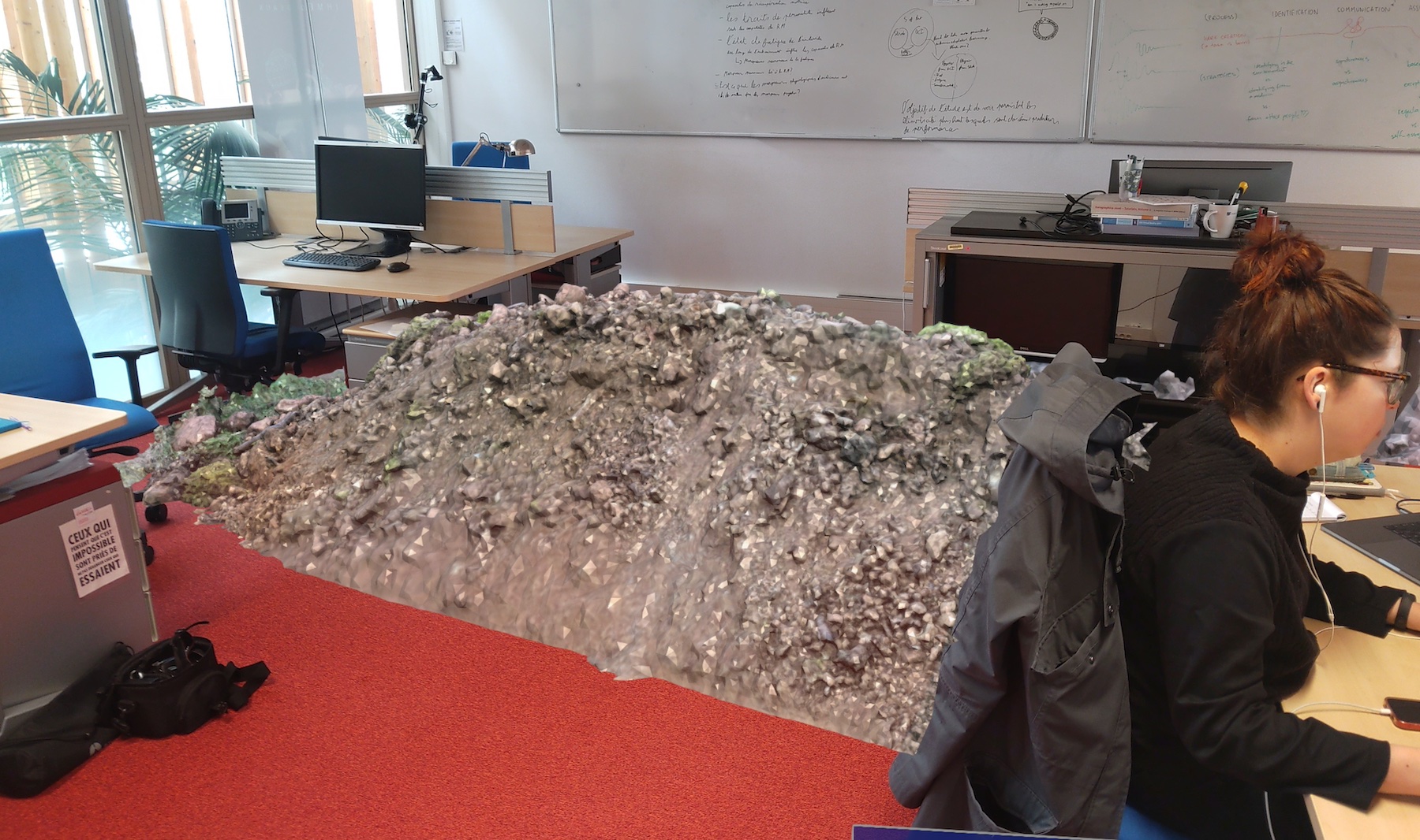
ARWAVs: A 3D visualization of waste accumulation in a real environment
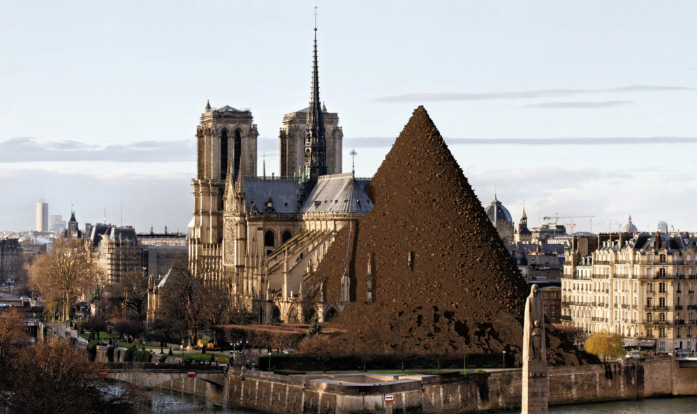
The negative impact of human activity on the environment is partly due to unnecessary waste. One likely contributing factor is the relative invisibility of waste: the waste produced by individuals is either out of sight, or quickly quickly disposed of. Nevertheless, waste disposal systems sometimes malfunction, causing waste to accumulate creating natural displays that can have an educational value. We’re taking inspiration from these natural displays and introduce a class of situated visualizations we call augmented reality waste accumulation visualizations or ARwavs. This demo includes several examples of waste accumulation visualizations in a direct physical environment: the accumulation of water bottles linked to domestic water consumption, the accumulation of rubbish bags due to domestic waste, the accumulation of plastic cups to account for the production of plastic associated with a coffee machine, and the accumulation of extracted earth related to the production of computer chips and components (see below). We also offer a a non-interactive version of this last example, displaying the the 3D dirt heap embedded in a neutral landscape photo (see the second figure below).
More information on this project is available on the project’s dedicated page.
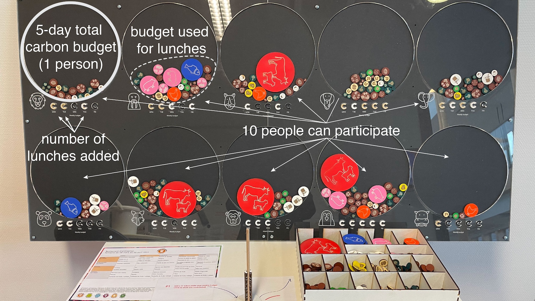
Edo: A participatory physicalization of data on the impact of food choices on climate
A participatory data physicalization, or PPD, is a physical visualization visualization that allows people to physically participate in the creation of the the creation of the visualization, by directly encoding their data. PDPs offer a way of engaging a community with data of personal interest that would otherwise be intangible. The Edo project is a PDP, enabling a small community to contribute its data to a physical visualization showing the impact of their food choices choices on the climate. In the context of this demo, we will show a scaled-down version of Edo, focusing on communicating orders of magnitude and how the frequency of certain choices plays an important role (see below).
More information on this project is available on the project’s dedicated page.
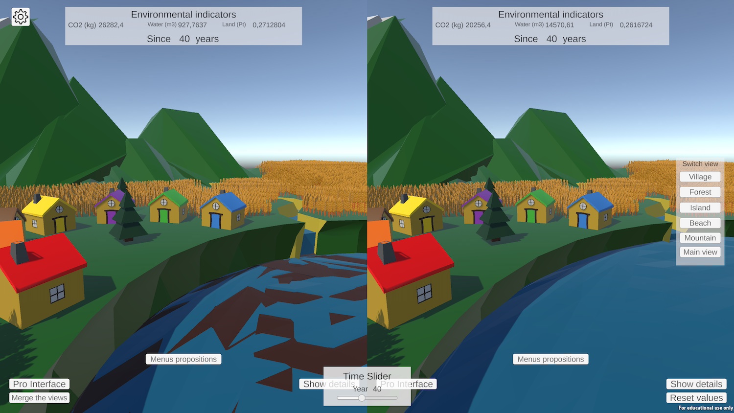
Dana: a mini-world to explore the environmental impact of food
Dana is an interactive software program that compares the environmental impact of several meals. Based on the exploratory concept of visualizations, this project aims to exploit the concreteness of environmental impacts to modify a virtual environment in the same way as climate change, intensive land use or excessive water consumption. The aim of this prototype is to question the strengths and weaknesses of this new type of visualization in terms of its ability to deliver non-experts about the environmental impact of food. In the context of this demo, the user will be able to be able to compose meals and explore how the mini-world evolves following these choices, with the option of comparing two meals at the same time (see below).
More information on this project is available on the project’s dedicated page.
Theme: Education
Learning with immersive technologies: a collaborative virtual reality task for education
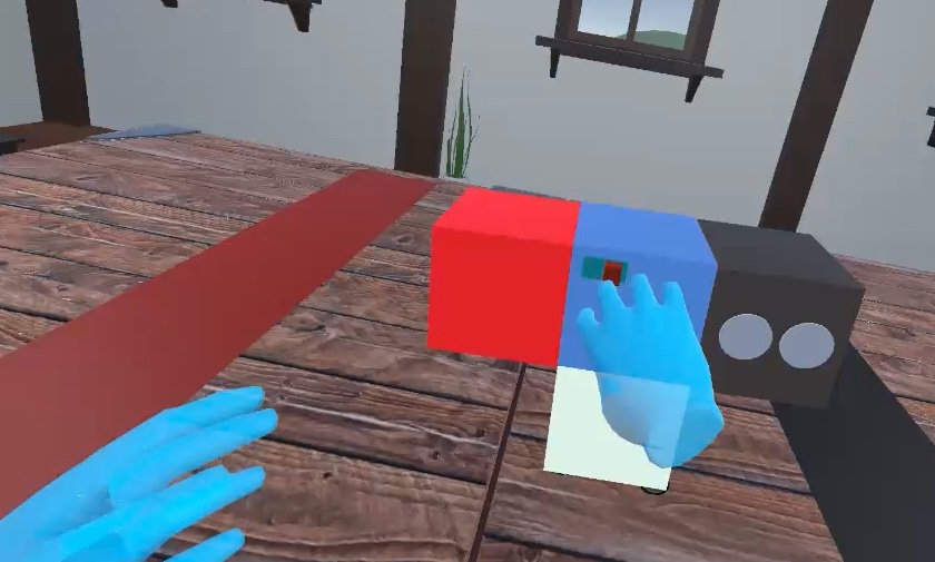
Immersive technologies hold great promise as an educational tool because they can foster interaction, immersion and collaboration between students, creating unique opportunities to enhance various aspects of learning, including proposing new ways together. However, collaboration in virtual reality (VR) can be difficult. The habits of collaboration acquired in real life don’t necessarily apply to this environment. For example, certain methods of communication and problem solving may need to be adapted, as certain “social cues” are missing in VR, such as the absence of facial expressions giving rise to challenges associated with the use of these emerging educational technologies. It is therefore necessary to study this collaboration in this particular context, and to design tools to take advantage of this technology and offer the most effective and enjoyable collaboration possible. To help the study and design of collaborative systems for education in VR, we propose a virtual reality application specially designed for collaboration between two people engaged in an educational task focused on creative problem-solving. The task is based on a learning task called “CreaCube”, introduced by Romero et al. This task involves the manipulation and assembly of 4 cubes from the modular robotics material Cubelets in order to build a vehicle that moves autonomously from an initial point to an end point, each cube having its own function: sensor, actuator, inverter or power on/off. Our application offers a unique opportunity to study the collaborative processes involved in the specific context context of learning, opening up new avenues for improving educational educational experiences through virtual reality. In this demo, users will be able to test this task in a collaborative context using Occulus Quest 2 VR headsets (see the image below).
Shire
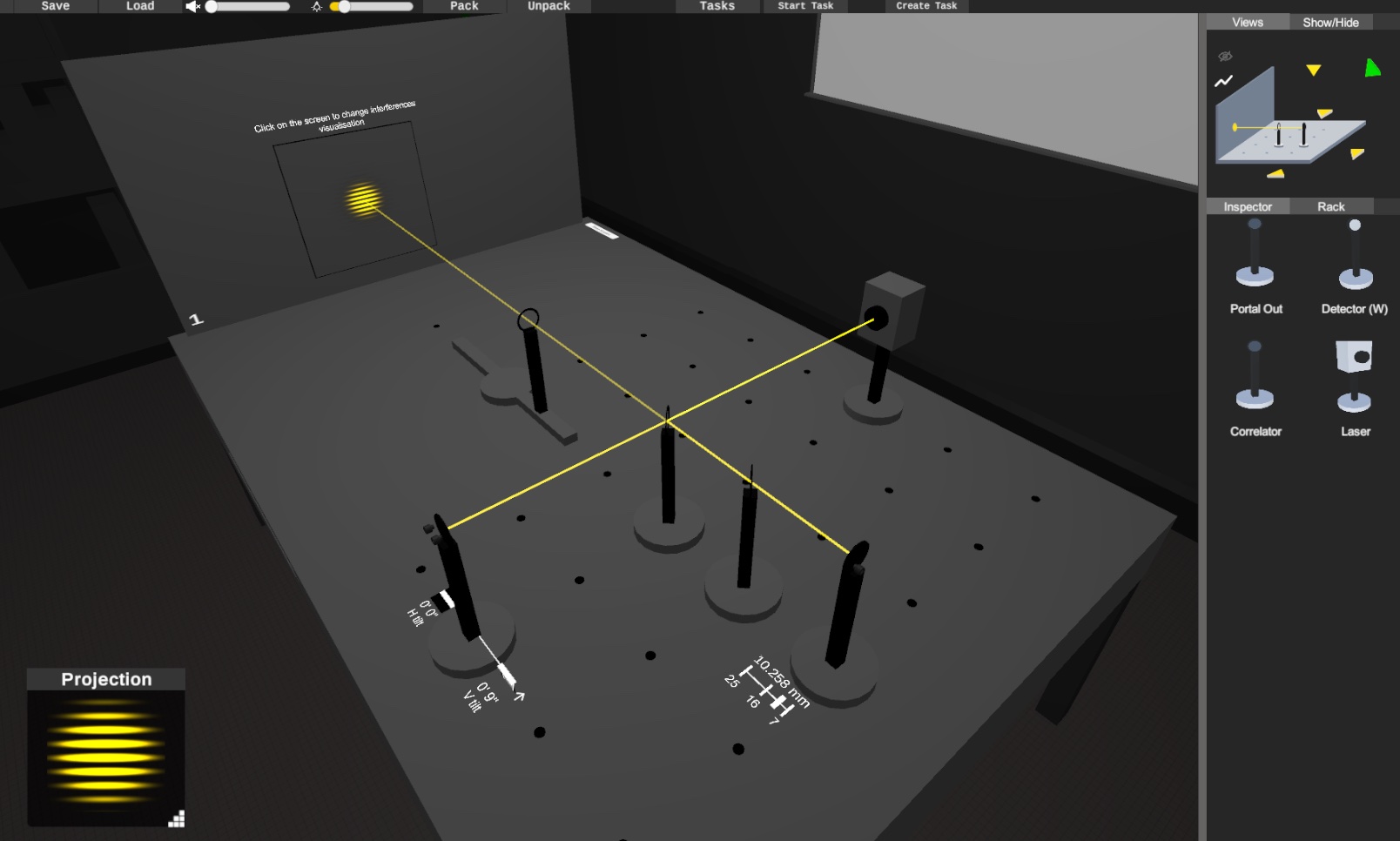
Learning optics is a challenge for students as they are confronted with notions that are sometimes abstract or counter-intuitive. To overcome this problem, theoretical courses are often are often coupled with practical work. The latter are unfortunately expensive or difficult to grasp. Against this background, the HOBIT project was launched to provide a tangible optical bench with a numerically simulated physical process, and thus provide students with an experimentation space that is both intuitive and enhanced with educational content. However, in a context of confinement, a device like HOBIT was no more accessible than a conventional bench. The SHIRE project addresses this limitation and aims to act as a complement to the HOBIT table, by offering a completely digital version of the latter, that can be used from home. Going digital also means some of the limitations of the tangible to offer a set of additional features such as encapsulation of a complete edit into a single element, saving and exporting experiments from one session to another. For this demo, the user will be guided in the creation of a wave optics setup on SHIRE which is often difficult for students: the Michelson interferometer (see the image below).
More information on this project is available on the project’s dedicated page.
Tangible motorized interactions in railway operation centers
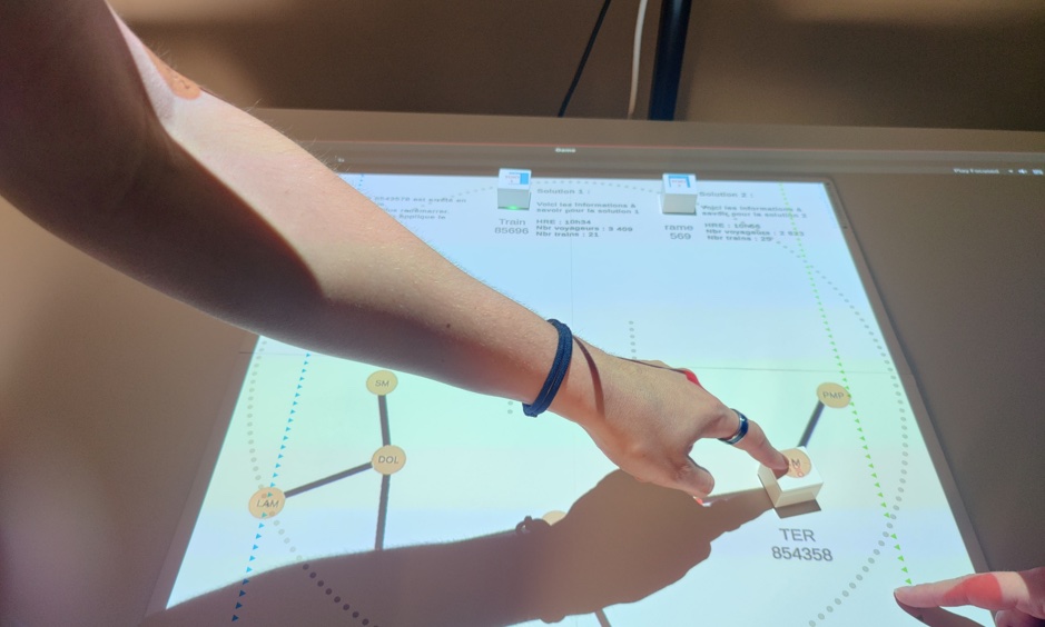
Operations centers play a vital role in rail traffic management. Operators manage this traffic in real time and are responsible for taking action in the event of disruption, in order to restore a normal situation as quickly and efficiently as possible. Our project proposes to study motorized tangible interactions (actuated tangible tokens, i.e. tangible objects that can move themselves but can also be moved by the user) in a context of time-constrained decision-making (see the image below). This demo shows a use case of this tool during a network incident. Solutions are represented by tangible objects. The users can visualize a solution proposed by the system by observing the movement of an object. They can add solutions themselves with another object. And finally, they can compare two solutions by placing the objects next to each other.
Visualizing the uncertainty of a trip through simulations
The duration of a trip (i.e. how long it takes to cover a distance between two points) is generally more or less uncertain. However, very often this duration is only communicated through a single numerical value (e.g., when using a navigation application like Waze or Google Maps, the trip time will be indicated by a single value such as “15 minutes”). However, However, this is an estimate made by the system, which involves uncertainty. We have developed a new technique (see image below) which visualizes how this temporal uncertainty can develop along the way, at different points, by animating the movement of a number of simulations (hypothetical trips). A simulation is represented by a circle moving moving along the path, potentially stopping at a traffic light, and occasionally slowing down if the road goes uphill. Our tool makes the uncertainty behind an estimate visible, and helps users with this complex concept. The tool can be demonstrated on any computer running a large number of simulations, and relies on requests to a local server to retrieve the metadata of different routes. One can then explore the various route options by choosing a city, then a point of departure and arrival, but also by choosing to impose detours along the route, thus creating a personalized route.

Data Comics: explaining concepts around data and their visualizations in comic book form
While traditional comic books tell stories about characters and their adventures, data comics tell stories about all the potential aspects of data: its collection, analysis, transformation, context transformation, context, conclusions, implications, criticisms, etc. Our studies have suggested perceptual advantages of data comics over infographics and text-image combinations. We have created an exhaustive list of 29 patterns to facilitate the creation and teaching of Data Comics in workshops. On our own and in collaboration with illustrators and scientists, we’ve also created Data Comics stories about child poverty and inequality, smoking, climate change and mass extinctions, as well as Data Comics Comics explaining data analysis processes and changes in dynamic networks. We created a graphical editor for interactive comics and a lightweight ComicScript scripting language for rapid prototyping of interactions on Data Comics. We are currently exploring the use of comics to communicate climate change and sustainability issues, data literacy, and healthcare. For the IHM demo, we demonstrate examples of data comics-static on paper, as well as interactive comics.
Theme: Welfare and Awareness
Live-It
Live-It is an augmented reality simulation of the symptoms of schizophrenia. It is designed to enhance the training of healthcare professionals and raise awareness among health care students, with the aim of reducing stigma through a “lived” first-person experience of these symptoms. In our simulation, users wear an augmented reality headset and perform an exercise. Meanwhile, they experience auditory hallucinations, designed based on those described by people suffering from schizophrenia. Users also experience simulated delusions (delusions are deeply-rooted beliefs that are not based on reality) by broadcasting their personal responses to the exercises on a virtual television present in the scene (see the image below). In our work, we seek to evaluate the effectiveness of our simulation in accurately representing the symptoms of schizophrenia, as well as reducing stigmatization. In the context of this demonstration, the user has the opportunity to experience a shorter version of the simulation, discuss their experience with the researchers, and provide feedback to the team if they wish.
Semantic zoom: feminicide awareness
By conveying information about humanitarian data, authors of infographics want their audience to understand the extent of a crisis in order to provide a quantitative perception. However, simply understanding the underlying numbers is not the only objective of such means of communication. The aim is also to provoke an emotional response emotional response from the audience, in order to generate empathy. In traditional visualizations, the human element is often overshadowed by the numbers. In order to bring the human element to the forefront, journalists tend to share the lives of victims through documentaries, sometimes in virtual reality for greater immersion. The advantage of this type of documentary is that it creates a stronger emotional bond with the audience, at the cost of a good understanding of the numbers.
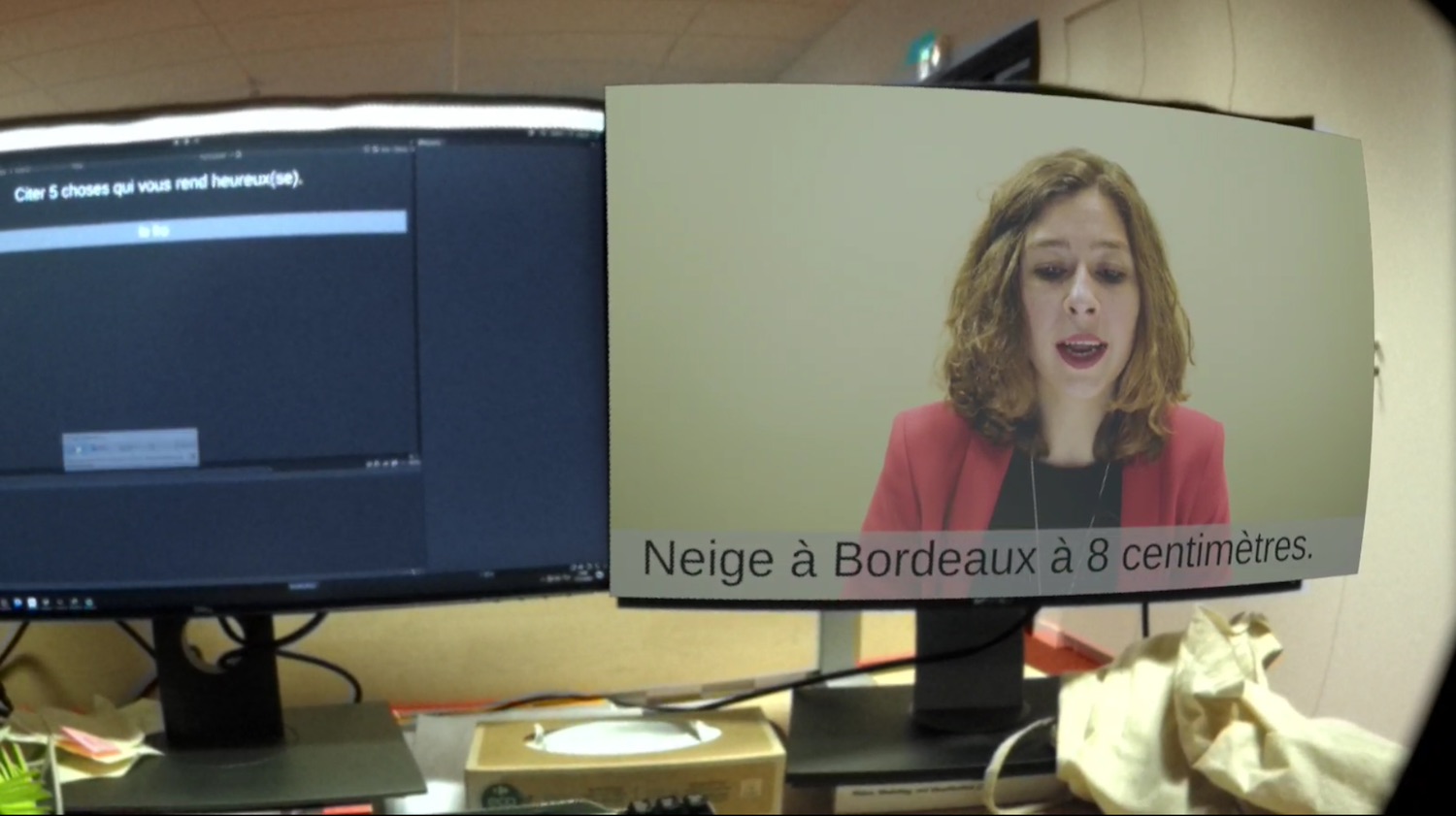
In this ongoing research project, we have drawn on concept of semantic zoom to combine a quantitative perception with a visceral perception of data. The user can zoom in and out of data sets to move from a bar graph to an environment where each victim is embodied by an avatar (figure the image below). In our demonstration, we propose to explore data on feminicide victims. By moving among the avatars, users can learn more about the victims and observe the diversity of profiles.
This work was supported by the French National Research Agency (ANR), grant numbers ANR-19-CE33-0012, ANR-22-CE33-0002 and ANR-22-CE33-0003.